Maps
See also: Results View, Regions,
MapWinGIS, Geographic
Mapping
Introduction
In addition
to using charts and tables to display results, you can also optionally
display LEAP results on maps. Using maps in LEAP also requires that
you separately install MapWinGIS.
Maps
in LEAP share most of the same controls for selecting results as other
chart types including the Tree on the left of the screen, the units selection
boxes immediately to the left of the map and the tool bars used to select
the type of results to be displayed. The Map screen is divided into
3 parts.
The main
map is displayed on the left of the screen. Use the
zoom control at the top left of the map to zoom in and out of
the map or select a rectangular shape on the map to zoom to that
extent. Alternatively, use the small locator map to the right
to navigate. You can also use the pan button ( ) to switch between
selection mode and panning mode in the map. Most options are also
accessible by right-clicking on the map.
) to switch between
selection mode and panning mode in the map. Most options are also
accessible by right-clicking on the map.
The legend
shown on the top-right part of the screen indicates the values
associated with each color used on the map.
The locator
shown on the bottom-right part of the screen gives you
a birds-eye view of the full extent of the map. A box drawn
on the locator map indicates the part of the map that is currently
selected. As you zoom-in or zoom-out of the map, the locator
box will be redrawn.
Regional Maps and Gridded Maps
Maps in Results View
are available in two circumstances:
Region Maps: In multi-region
areas only, regional results can be displayed on a map with each
region corresponding to one shape on the map. Regional results
can be shown using three types of maps: gradient maps, bar chart
maps and pie chart maps. Gradient
maps show results by color coding each map shape. The
bar chart maps and pie chart maps show multiple
small bar and pie charts on a map, with each small chart centered
on a region and with each individual chart showing time series
data. These three types of maps require no additional data
beyond mapping your regions to shapes in your chosen shape file.
The shape file is chosen on the Mapping
tab of the General: Settings
screen. Regions are mapped to shapes in the General: Regions screen. With
gradient maps, the legend
shown to the right of the map shows the range of values contained
within each category. Gradient maps can be shown using different
categories. Click the categories button below the legend
to select among different categorizations. The categorization
methods available are:
Natural
Breaks: The position of breaks are chosen to minimize
the sum of square deviations within categories. The algorithm
is heuristic, therefore gives only an approximation of the
real position of natural breaks, but typically is recommended
as suitable in most cases.
Unique
Values: A category will be created for each unique
value of the field. In most circumstances, this will
mean that each region is in a separate category.
Equal
Intervals: Each category spans an equal range.
Equal
Count: Each category contains a (roughly) equal number
of regions.
Standard
Deviation: Six categories are created, with the range
of each of them equal to the standard deviation of the values.
Three categories hold values greater than the mean and three
lower than it.
Examples of gradient and bar chart maps are
shown below:
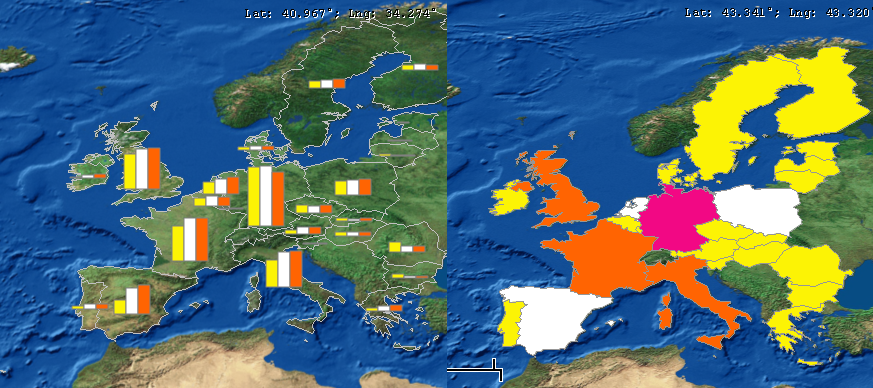
Two examples of the bar and gradient
map chart types in LEAP, showing results for each region in a European
model.
Gridded Maps: In both single
and multi-region areas, selected energy and environmental loading
results can be displayed on a Gridded
Map. Displaying this type of map requires three additional
steps. (1) First, enable the Map
Results to Grid option on the Scope & Scale tab of
the General: Settings
screen; (2) Next, load a series of proxy GIS data sets into LEAP
describing a range of socio-economic variables that are used to
allocate energy use and emissions to the map's grid squares (for
example a population map might be used to allocate household energy
use to map grid squares). You can set up these proxy GIS data
sets using the General: Geographic
Mapping screen. (3) Finally, use the Geography
variable to allocate energy use and emissions from each LEAP branch
to the map's grid squares. Once you have taken these three
steps, the additional Gridded Map chart type will be available
in Results View via the Chart Type button ( )
. An example of a gridded map chart type is shown here.
)
. An example of a gridded map chart type is shown here.
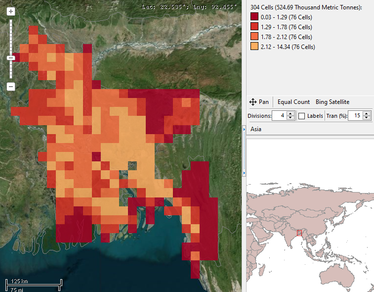
An example of the gridded map
chart type.
When viewing gridded maps, it can be particularly
useful to use the Split screen view which shows both a map and a table
containing all the gridded values in the map. The table is color
coded so that values are shown with the same colors as in the map. You
can navigate among the table values by holding down the control key while
hovering over the map. The table will then automatically scroll
to show the value corresponding to the map grid square pointed to by the
mouse cursor. You can also show an additional chart next to the
table, which shows the time trends in each scenario for the highlighted
grid square. Below, we show an example of using the split screen
to view a gridded map and to zoom in on the trends for a particular map
square.
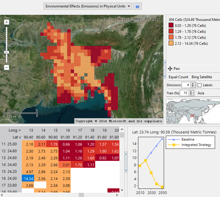
Using the split screen view with
a gridded map to zoom in on the trends for a particular map square.
Map Options
The main options used to control the look of the
map are collected on the tool bar shown below the legend. The map options
include:
Pan: use the pan button to
switch between two modes for the mouse cursor: panning around the
map or selecting a region of the map.
Image:
Select an internet tile service to provide a background image for
the map. The tile services supported are Bing
and Open Maps. You can
also opt to display a static background image or no background. To
use a static background image, first select it on the Mapping tab
of the General: Settings
screen.
Labels:
Show or hide the labels associated with the map regions. Go
to the General: Settings:
Mapping screen to select the field in the shape file that contains
the shape labels.
Divisions:
Select the number of value divisions on the map. Each
division corresponds to an item in the map legend. You can also
select the algorithm used for calculating the division intervals.
Division options include: linear, equal count, log and reverse
log.
Chart
Size: Use this spin edit to adjust the size of bar and pie
charts displayed on a map. The default is 100%. Only relevant
for maps with bar and pie charts.
No Collisions:
Use this check box to adjust whether overlapping (colliding) charts
will be drawn on the map. Only relevant for maps with bar and pie
charts.
Transparency:
Set the transparency of the chart layer from 0-100% so that the background
image can be partially viewed through the mapped results.