A Sankey Diagram for a LEAP Area
Menu
Option: View: Energy Balance
See also: Energy
Balance View, Energy Balance
Table, Energy Balance Chart
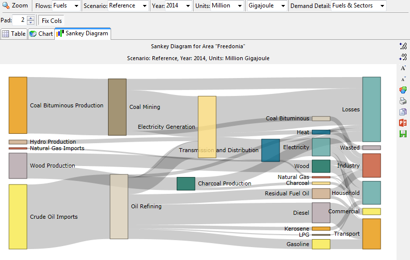
A Sankey Diagram for a LEAP Area
Sankey diagrams are a type of flow diagram made of nodes connected by links, in which the width of the links is shown proportional to the energy flow being represented. For more on Sankey diagrams and their origins see this.
Sankey Diagrams in LEAP are available as a tab in the Energy Balance View. They give an overview of energy flows through a LEAP area from resources through each transformation module to energy demands. They include a representation of such details as imports, exports, stock changes, statistical differences and losses.
You can display a Sankey diagram for any year of any scenario. In multi-region areas you can show the Sankey diagram for the whole area or for any particular region.
The Sankey diagram has a number of configuration options including whether to display flows for each fuel or flows for categories of fuels You can also set the level of demand detail to (1) fuels only, (2) fuels & sectors or fuels, or (3) sectors and subsectors.
Apart from showing a Sankey Diagrams for the whole area, you can also
Zoom In ( )
to see a Sankey Diagram for any particular Transformation module such
as Electric Generation or Oil Refining. The Zoomed In Sankey diagram
shows inputs and outputs to and from each process, feedstock and auxiliary
fuel use, and coproduction of energy and losses.
)
to see a Sankey Diagram for any particular Transformation module such
as Electric Generation or Oil Refining. The Zoomed In Sankey diagram
shows inputs and outputs to and from each process, feedstock and auxiliary
fuel use, and coproduction of energy and losses.
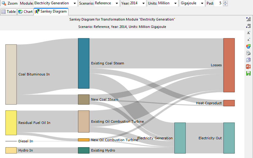
A "Zoomed In" Sankey Diagram
for a Transformation Module named "Electricity Generation"
The Sankey Diagram's nodes and links are laid out automatically but
you can also fine tune the layout by dragging and dropping any node to
perfect the look of the diagram before printing it ( ),
copying it (
),
copying it ( ), exporting it to a JPEG file (
 )
or exporting it directly into a PowerPoint slide (
)
or exporting it directly into a PowerPoint slide ( ).
).
Additional options for configuring the Sankey diagram include the ability
to change the colors of the diagram nodes ( ),
to increase (
),
to increase ( ) and decrease (
 )
the number of decimal places in which values are shown, adjust the fonts
used for labeling the diagram, set the energy units, show or hide the
display of values on each node and adjust the padding (vertical spacing)
between nodes.
)
the number of decimal places in which values are shown, adjust the fonts
used for labeling the diagram, set the energy units, show or hide the
display of values on each node and adjust the padding (vertical spacing)
between nodes.
Sankey Diagrams in LEAP are made possible by recent developments in online interactive data visualization. They are based on the D3.JS Javascript library and the D3 Sankey Diagram visualization developed by Mike Bostock, leader of the D3.JS group and modifications to the Sankey Diagram code developed by Denes Csala.