 Sankey Diagrams
Menu Option: View: Energy Balance
See also: Energy Balance View, Energy Balance Table, Energy Balance Chart
Introduction
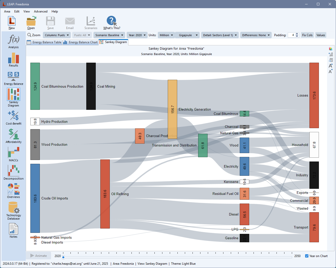
Sankey diagrams are a type of flow diagram made of nodes connected by links, in which the width of the links is shown proportional to the energy flow being represented. For more on Sankey diagrams and their origins see this website. Sankey Diagrams in LEAP are available directly from the View Bar ( ) or as a tab in the Energy Balance View. They give an overview of energy flows through a LEAP area from resources through each transformation module to energy demands. They include a representation of such details as imports, exports, stock changes, statistical differences and losses.
You can display a Sankey diagram for any year of any scenario. In multi-region areas you can show the Sankey diagram for the whole area or for any particular region.
The Sankey diagram has a number of configuration options including whether to display flows for each fuel or flows for categories of fuels You can also set the level of demand detail to (1) fuels only, (2) fuels & sectors or fuels, or (3) sectors and subsectors.
Apart from showing a Sankey Diagrams for the whole area, you can also Zoom In ( ) to see a Sankey Diagram for any particular Transformation module such as Electric Generation or Oil Refining. The zoomed-in Sankey diagram shows inputs and outputs to and from each process, feedstock and auxiliary fuel use, and co-production of energy and losses.
The Sankey Diagram's nodes and links are laid out automatically but you can also fine tune the layout by dragging and dropping any node to perfect the look of the diagram before printing it ( ), copying it (
 ), exporting it to a JPEG file (
 ) or exporting it directly into a PowerPoint slide (
 ).
).
Additional options for configuring the Sankey diagram include the ability to change the colors of the diagram nodes ( ), to increase (
 ) and decrease (
 ) the number of decimal places in which values are shown, set the energy units, show or hide the values of each node, and adjust the padding (vertical spacing) between nodes.
Useful Energy Analysis
If you have checked the Calculate Useful Energy for All Demands box in the Settings: Scope screen, then you can also optionally display an extended Sankey Diagram that summarizes useful energy demands as well as final energy demands. To show useful energy demands, click Show Useful Energy in the toolbar. When enabled, the Sankey shows a column with final energy demand by fuel and useful energy demand by sector and (if selected) by subsector. Useful energy demands are generally smaller than final demands due to the losses in final energy using equipment. Therefore, when showing useful energy demands, you will see that overall energy losses in the system are generally much larger versus a Sankey that only shows final energy demands. Note however that for some key end uses such as heat pumps, refrigerators, and air conditioners that have efficiencies greater than 100%, useful energy demands will actually be larger than final energy demands. Of course energy cannot be created from nothing. These devices work by extracting ambient energy from the air or from the ground. When a LEAP Sankey Diagram contains such devices, you will see an additional energy source listed on the left of the Sankey and labeled "ambient energy".