 Add:
Click to add a new branch/variable combination as a row in the report.
Use the Branch/Variable
selection wizard to specify the branch, variable, units, scaling factor
and any special results filters for the each variable.
Add:
Click to add a new branch/variable combination as a row in the report.
Use the Branch/Variable
selection wizard to specify the branch, variable, units, scaling factor
and any special results filters for the each variable. See also: View Bar, Summaries View, Cost-Benefit Summary Reports, Decomposition Reports, Marginal Abatement Cost Curve (MACC) Reports
Unlike results show in the Results view, which display the values of a single variable, user-created summary reports are able to show the results for multiple variables on a single chart or table. This type of report can be created and displayed from the Summaries View screen in LEAP.
User-created summary reports consist of rows, each of which displays either a heading or one variable for a given branch in the tree and columns which can be configured to display years, scenarios and regions as the columns of the report.
Use the Manage Summaries screen to create a named user-created summary report. You can create as many of these reports as you like, each of which can show results for different variables. Use the following options to edit individual reports:
Add:
Click to add a new branch/variable combination as a row in the report.
Use the Branch/Variable
selection wizard to specify the branch, variable, units, scaling factor
and any special results filters for the each variable.
 Delete:
Click to delete the currently highlighted row of the report. Note that
you will not be deleting any data, you will only be removing the row from
the report.
Delete:
Click to delete the currently highlighted row of the report. Note that
you will not be deleting any data, you will only be removing the row from
the report.
 Edit
Click to edit the branch/variable in a row.
Edit
Click to edit the branch/variable in a row.
Heading: Click to insert either a blank row in the report, or to insert a subheading. You will be prompted to enter text for the heading. Leave this blank to enter a blank row. LEAP will automatically group the rows between headings.
 Up:
Click to move the current row up.
Up:
Click to move the current row up.
 Down:
Click to move the current row down.
Down:
Click to move the current row down.
Columns: Use the two Columns selection boxes to select all or selected years or scenarios as the rows of the report. Notice that only scenarios marked for calculation in the Manage Scenarios screen are available. When displaying years as columns, a further selection box will be displayed in which you select a scenario to be displayed in the report. Similarly, when scenarios are the columns, a further selection box will be displayed in which you select a year to be displayed in the report.
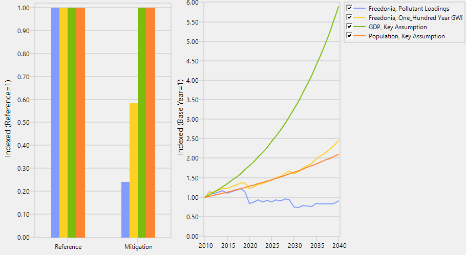
User-created summary reports can be displayed both as tables and as charts. When showing in chart format, the format of the chart will depend on the whether columns used in the tabular report. When showing results by region or scenario, the chart will display values in bar chart format. When showing years, the chart will display values as a line chart, with values indexed to a base year value of 1.0. Two examples of this are shown below:
Various on-screen options displayed in a tool
bar on the right of the screen can be used to customize the display of
the tables and charts. You can increase ( )
or decrease (
)
or decrease ( ) the number of
decimals displayed in the table, change the display of grid lines on the
chart (
) the number of
decimals displayed in the table, change the display of grid lines on the
chart ( ), change the table font (
 ),
export tables to Excel (
),
export tables to Excel ( ), print and preview tables
and charts (
), print and preview tables
and charts ( ), copy charts
and tables to the Windows clipboard (
), copy charts
and tables to the Windows clipboard ( ),
and export charts to PowerPoint (
),
and export charts to PowerPoint ( ).
).