Topic: Base Year Demand Bar, in Results view Subscribe | Previous | Next
Elusiyan Eludoyin 1/2/2016
574 Views Hello Sir/Madam,
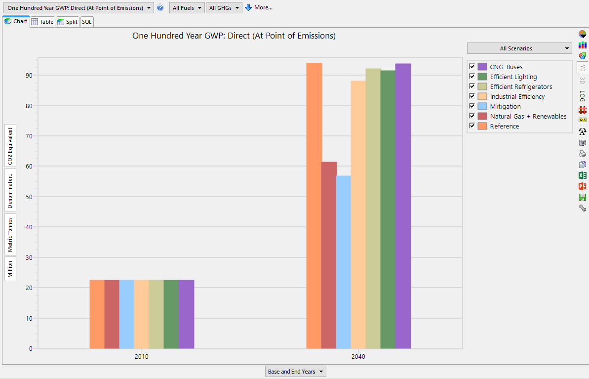
Is it possible for me to indicate the base year (current accounts) along with the selected scenarios in a bar chart, in results view?
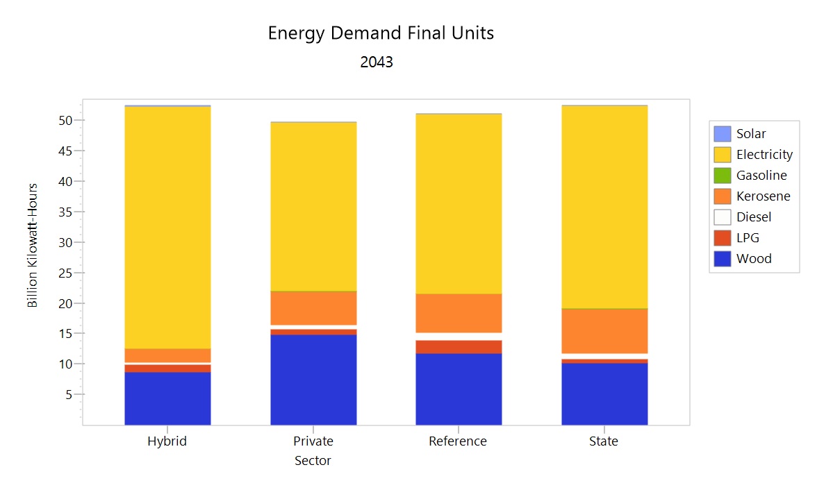
I wish to compare and indicate the energy demand in final units across different fuels in each of my scenarios at a particular ear, together with the base year (current accounts year).
From previous posts it seems like this is possible for 'supply' results using historical production. Please I need to indicate this for demand.
Thank you very much
Best,
Elusiyan
573 Views Hi Elusiyan,
Try viewing All Scenarios as categories, and choosing Base and End Year (or Selected Years) along the x-axis. The chart type can be changed to a bar chart by clicking the pie-chart icon at the top of the right toolbar.
Hope this helps,
Taylor
568 Views Hello Taylor,
If I do it your way, I will be unable to view the energy demand in final units for different fuels in a stacked bar
I'm hoping for something as shown in the example, only with a stacked bar showing the fuel use in the base year (current accounts).
Is that not possible??
Thanks
Elusiyan
567 Views Hi Elusiyan,
Ah - I didn't realize you wanted to display different fuels separately from one another. Since LEAP allows you to choose only one dimension for each axis, you cannot show both separate scenarios and separate fuels, for more than one year across the x-axis.
I would recommend that you proceed using the same type of chart you've included as an example, but generating a separate chart for your base year and any scenario years. If necessary, you can export these data to Excel to create a customized chart (displaying both pieces of information).
Best,
Taylor


