Topic: Data visualisation of GHG emission Subscribe | Previous | Next
Natalie Chung 3/30/2021
2 Likes Dear colleagues,
I am trying to generate a graph that can show GHG emissions over the years divided by demand sectors. However, after trying various options on the visualisation tab, the graph could only show GHG emission divided by output fuel types (like coal, natural gas, diesel etc). May I know if there is a solution to this problem? Thank you very much!
.png)
Charlie Heaps 3/30/2021


4 Likes Hi Natalie,
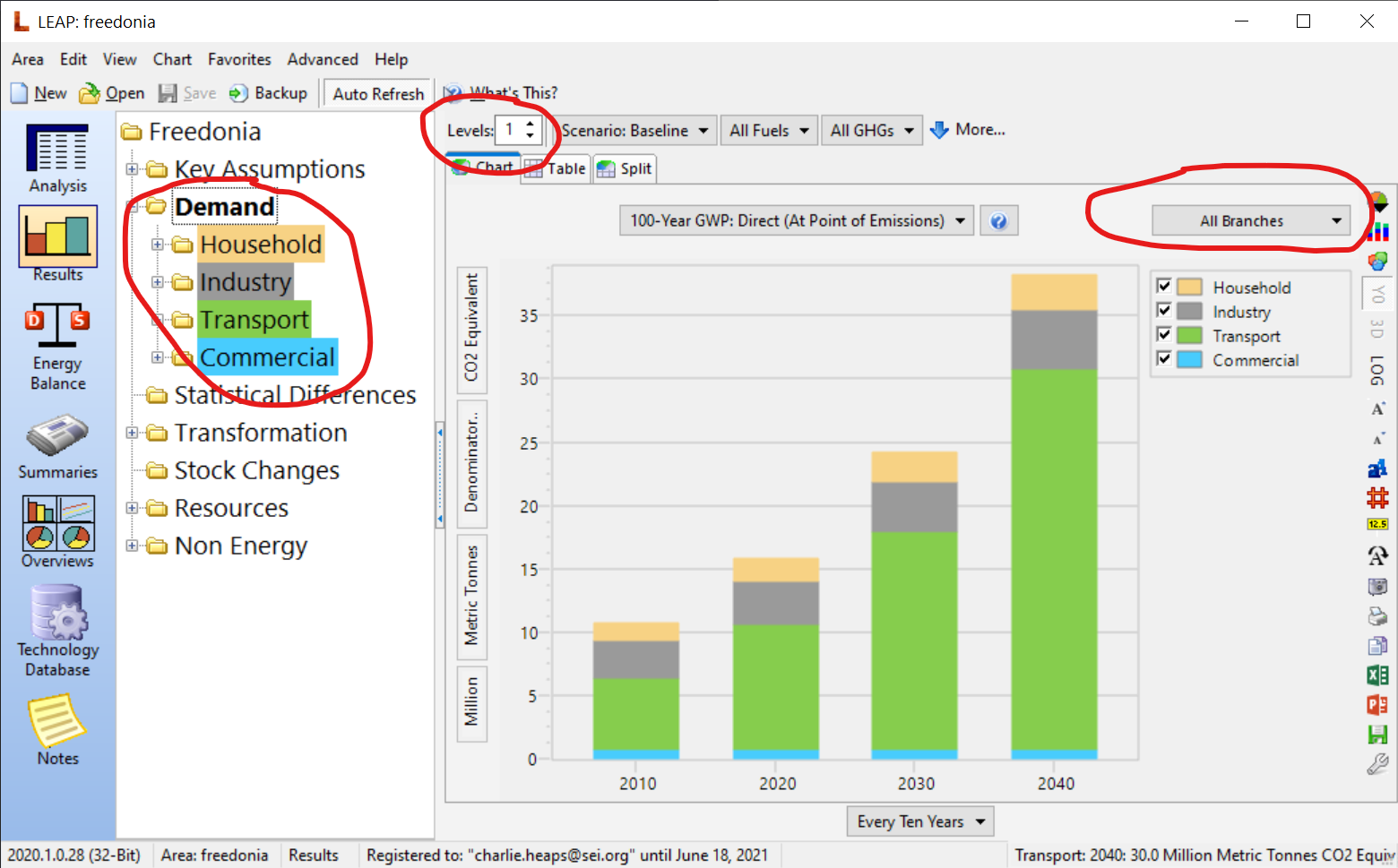
In Results view, select "Branch" from the selection box above the chart legend. When showing branches you can also set the Levels in the top toolbar. Levels=1 shows one series in the chart for each branch immediately below the branch selected on the tree on the left of the screen. Levels=0 shows just one series (the branch selected in the tree). In the attached screen shot I'm showing a chart with Levels=1. Notice also that you can color code the branches in the tree to match those in the chart. To do that, right-click on the tree and select Color Tree Branches.
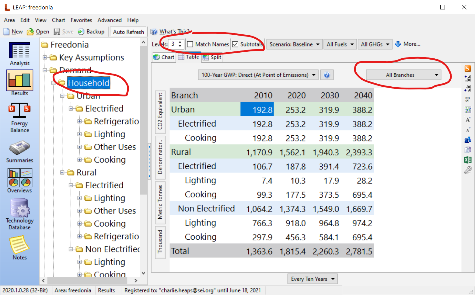
You can also set Levels>1 in which case LEAP will show results for multiple levels. When Levels > 1 you will see an extra checkbox labeled Match Names. Check this to cross-tabulate results based on the branch names at the lowest level. If showing results in table format you will also see a check box labeled Subtotals. Check this to show a formatted table showing totals and subtotals at each level (see second screenshot).
I hope this helps!
Charlie
Iqbal Novemsa 3/31/2021


Muhammad Rafif thariq azizi 4/1/2021